IREN
NEW LOGO
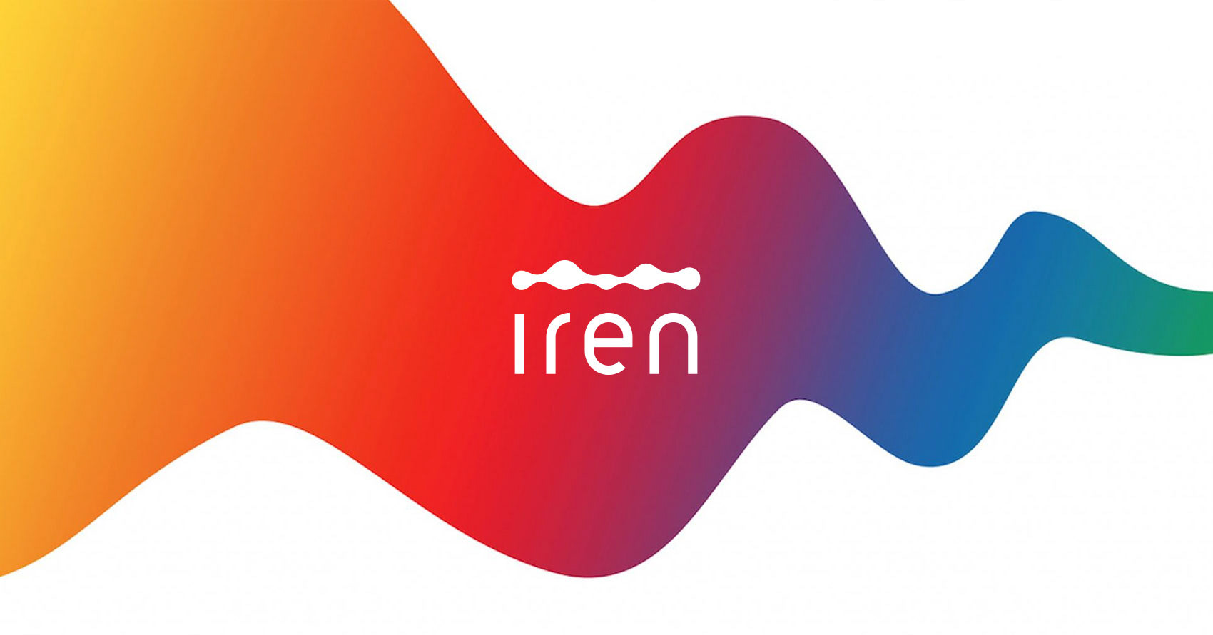
Nel 2020 ci siamo occupati del rifacimento del logo di IREN, azienda provider di energia e servizi per la green economy, in occasione del loro lancio sul mercato nazionale Italiano.
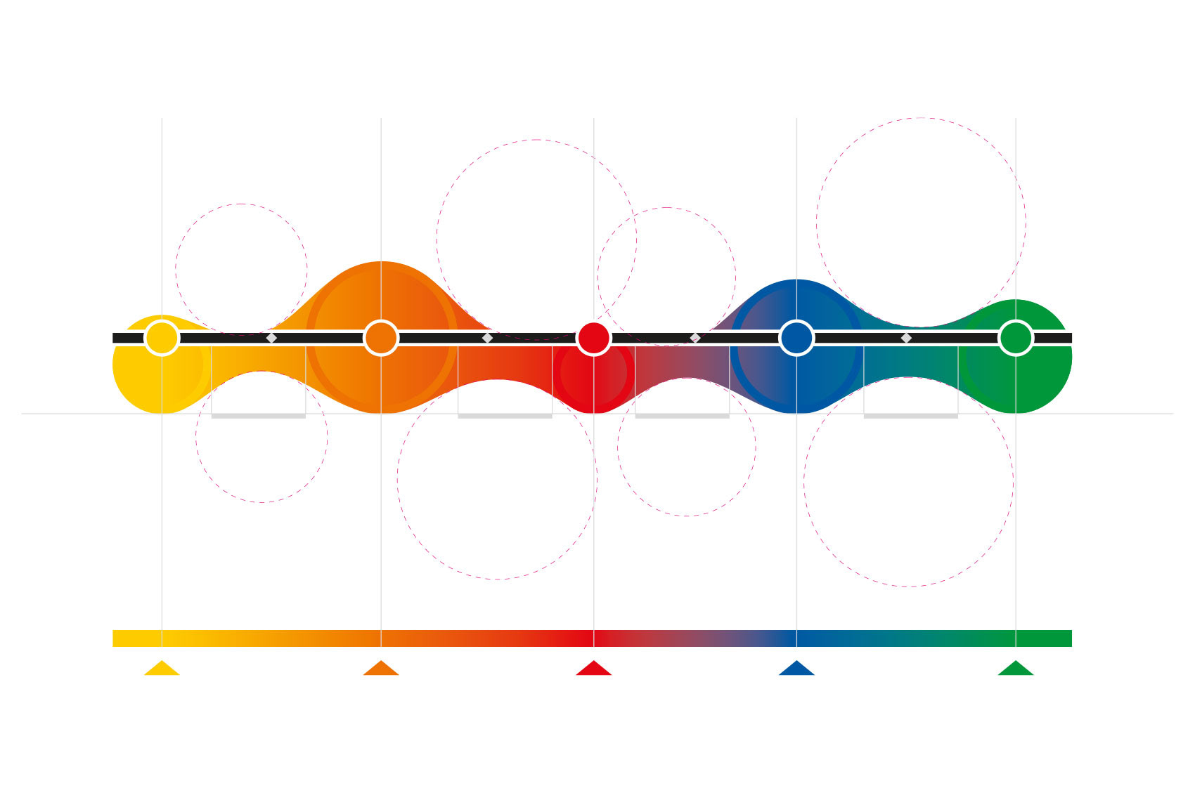
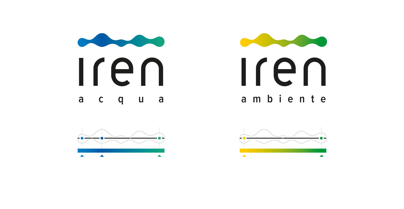
Lo storico marchio a pallini è stato trasformato in un’onda (flusso di energia), così come i colori sono stati fusi in un gradiente a simboleggiare la completezza e contiguità dei servizi offerti e la coesione delle diverse unit del provider.
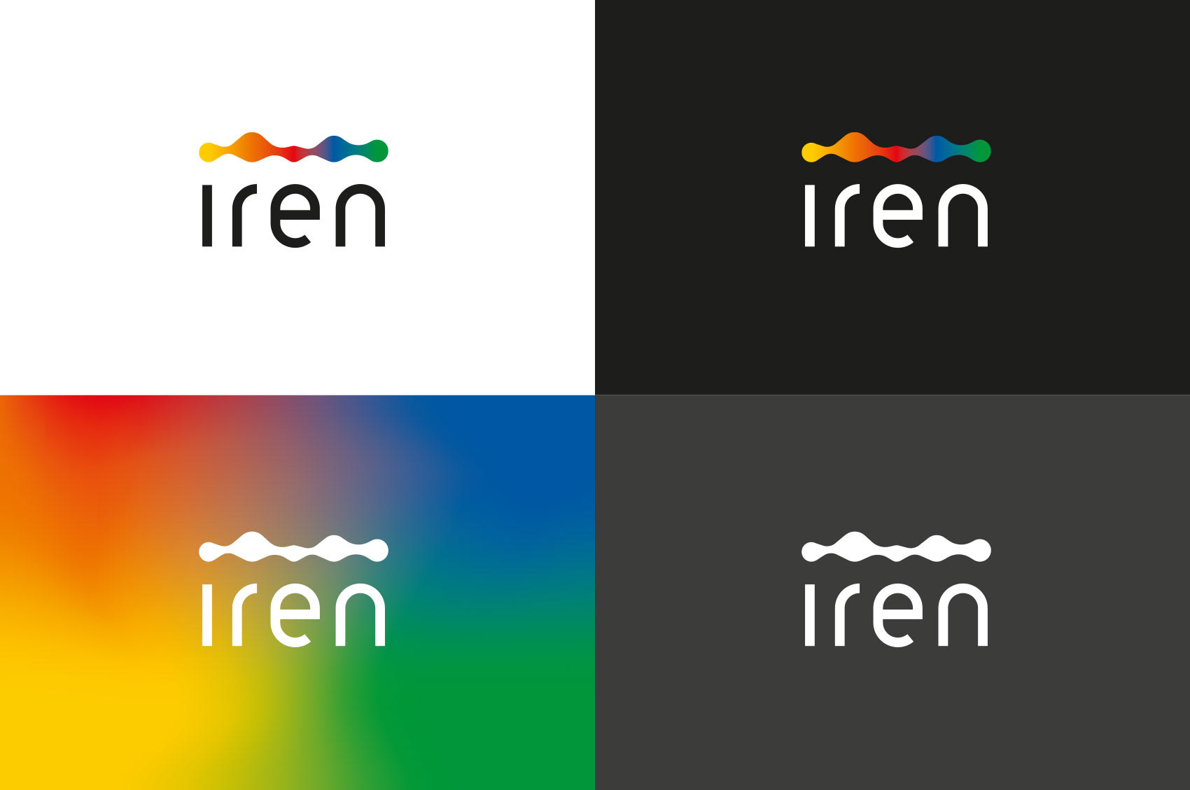
Il logotipo è stato completamente ridisegnato per dare freschezza e modernità al brand.
Il logotipo è stato completamente ridisegnato per dare freschezza e modernità al brand.
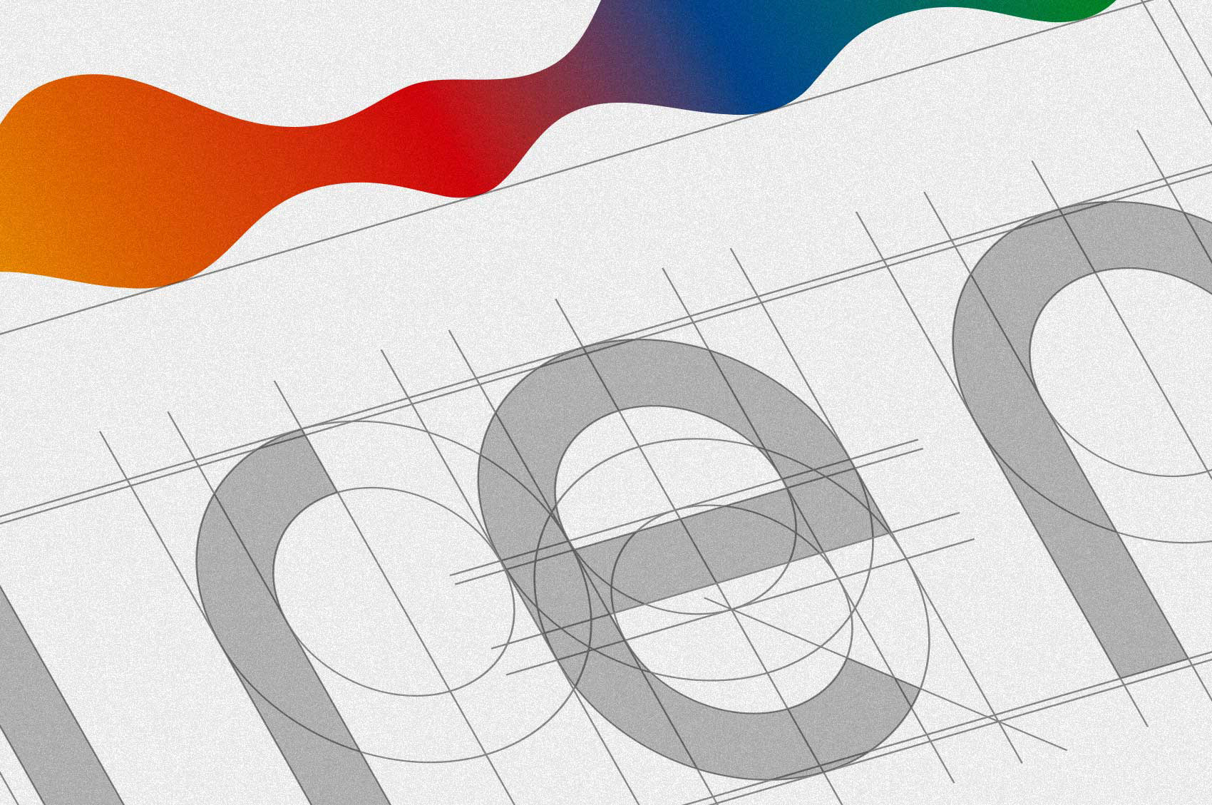
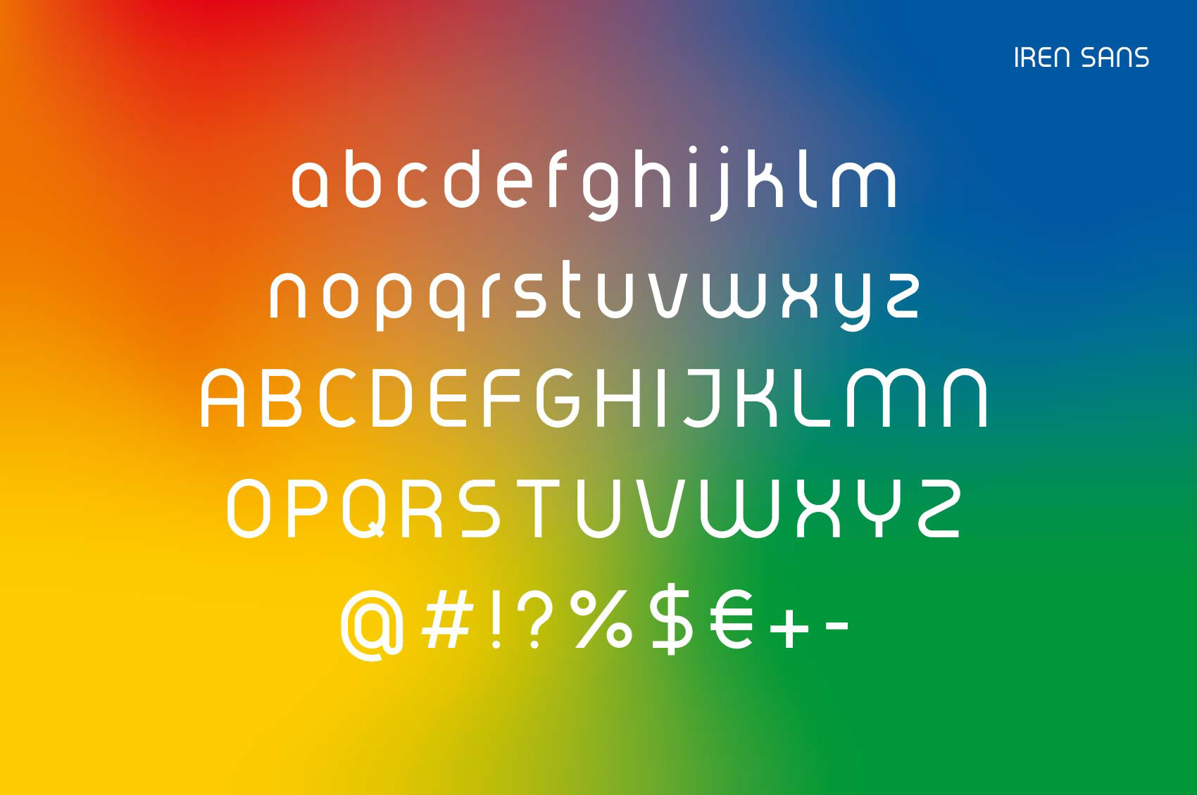
Sulla base del nuovo logotipo, abbiamo sviluppato il font IRENsans.
In 2020 we developed the new logo of IREN, italian provider of energy and green economy services, in occasion of their “go national” campaign.
The existing colored dots have been unified into a wave shape (energy beam), and the colors have been fuse into a gradient to represent the continuous stream of different services and the internal cohesion of different department.
The wordmark has been completely redesign to give the brand a more fresh and modern touch.
Following the new wordmark, we designed the IRENsans font.

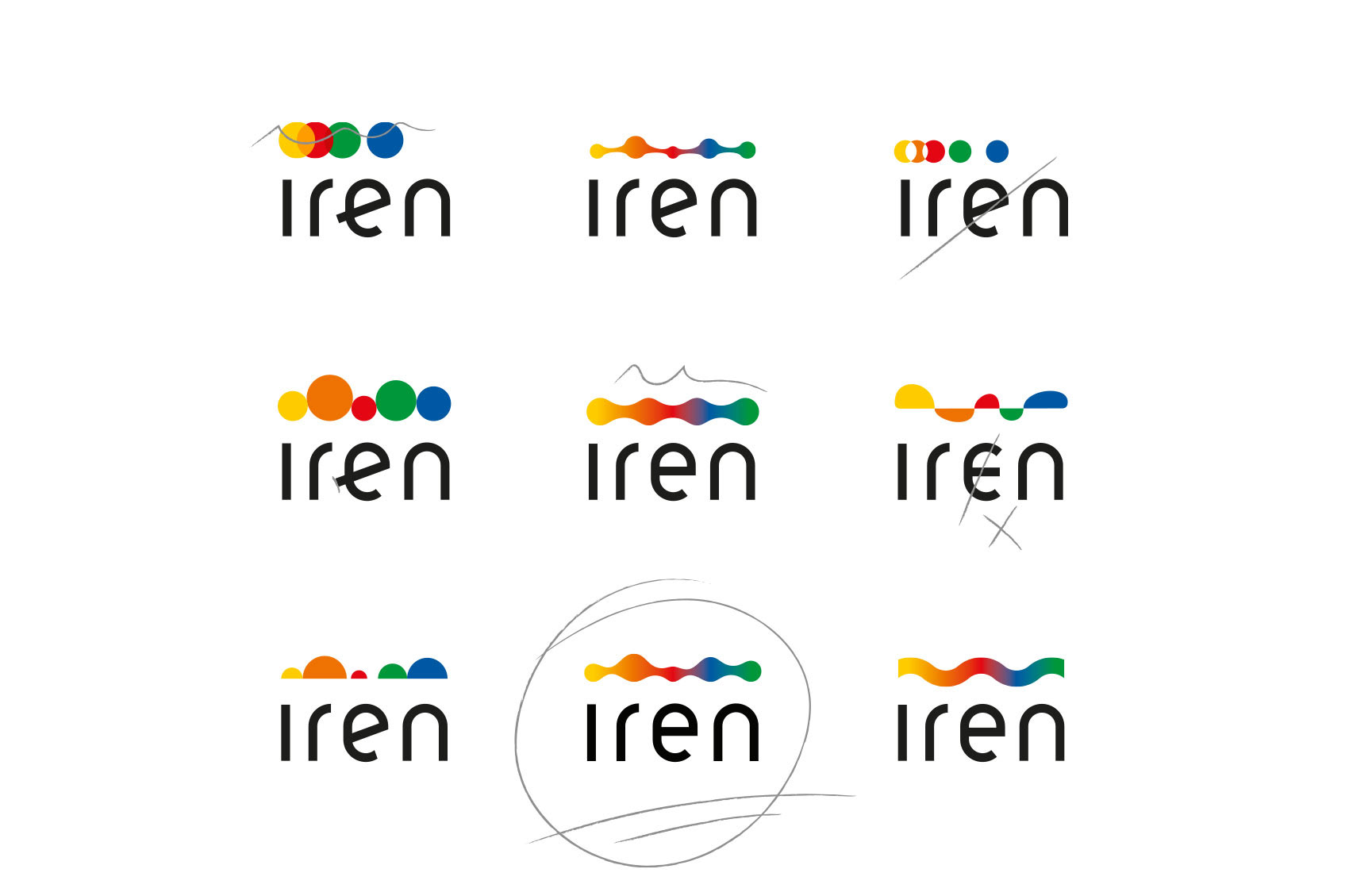
:::: DIFFERENT KINDS OF ENERGY ::::
:::: MULTI-SERVICE (ENERGY, E-MOBILITY, RECYCLE) ::::
:::: COMPANY’S DIVISIONS UNITED ::::
:::: CONSTANT CHANGE, EVOLUTION ::::
:::: ADAPTIVE SHAPE, TAILOR MADE OFFER :::::